Short Notes
A collection of short notes and speculations on various technical topics.
On Data Formats
I’ve been playing around with the iPod implementation of vcards, which it uses for contact information. I’m not impressed, for several reasons:
Apple only allows a subset of vcard fields. Nickname? Nope. Birthday? Sorry.
It imposes some arbitrary restrictions on the fields it does allow. For example, a contact can have multiple email addresses or telephone numbers, but only one URL. C’mon, this isn’t 1995! What’s “the” URL for a person with a personal site, a business site, a blog, a Flickr page, and pages on a handful of social networking sites?
The biggest problem I have, though, isn’t Apple’s fault: it’s the impoverished nature of the vcard spec. I generate vcards from free-form key:value pairs stored in my personal wiki. This leads to two problems: (1) there may not be a matching vcard field (e.g., “anniversary”), or (2) the field may exist, but not have a corresponding subtype (e.g. the vcard spec has “tel”, but not “tel (emergency)”). What to do? Drop the “emergency” tag, or stick the number in the “notes” field? Neither answer is good. And where do I put “anniversary”? Does it, too, go in “notes”?
The funny thing is, it would have been easier for Apple to implement contact info as a simple set of key:value pairs, translating vcards on the fly.
2008-05-22
Tip: Nonprinting Text
When printing in Windows, the printer might refuse to print some of your text, even though it printed other text in the same font on the same line. Or perhaps it refuses to print capital letters, along with a few other random glyphs.
Changing the point size of the nonprinting text by a very small fraction (e.g., .1 or .2 pts) sometimes fixes this problem. The difference won’t be noticed by casual readers. You’ll want to maintain the original leading, especially if the text spans multiple lines.
2007-08-09
Dump Apples
Demerits to Apple for their latest change to iTunes: you can no longer hide the link to the iTunes Music Store. Since I don’t have a credit card or PayPal I can’t sign up for iTunes, so that link is useless. For me, the iTunes interface is not only less usable, there’s now a region which is downright annoying to accidentally click.
While I’m at it, I’d also like to castigate Apple for putting free podcasts behind a pay wall. What a good way to discourage people from using your store: offer them something free, but make getting it a pain. The stupid part, of course, is that nothing compels Apple to require payment information during customer signup; they don’t need that info until you actually want to buy something. The decision to require the information up front is pure marketing.
Recently some friends have mentioned how pleased they are that, in comparison to Windows and Linux, their Macs “just work”. Maybe. But stupid stuff like this (not to mention iTunes’ nonnative Windows UI, with its ubiquitous Apple logo) makes me loathe to drink the Kool-Aid.
2007-02-09
Update, : You can remove the iTunes Store link. Apple moved the option into a completely nonintuitive location (it’s now under Parental Controls in the Preferences menu).
Broken by Design: Apache Web Server Online Manual
Every time I install the Apache Web server, I’m reminded that its online manual drives me nuts. It’s not the content that’s the problem, it’s the form. By default, the HTML manual depends on content negotiation to select the translation of the manual you prefer: English, say, instead of German or Japanese. The problem is that content negotiation only works when files are served by a Web server (i.e., Apache). If they’re loaded from the local file system, content negotiation doesn’t work. Loading manual/index.html gives junk; instead, you must load manual/index.html.en (or .jp or .fr or whatever).
So let’s recap. If you can’t get Apache running because of configuration problems, the logical place to look for help is the manual... but because Apache isn’t yet running, you must load the pages as files, which breaks every link in the manual.
Way to go, Apache group, for shipping a manual with every link broken. By design.
2007-02-08
CSS: It Loads the Gun For You, Too
While musing today about CSS’s purpose (separating content from presentation), I was struck by how far CSS’s selectors are from conceptual purity. The basic examples of selectors are .class and #id, which respectively select a class of similar items, or a unique item. These makes sense, as the selectors only choose items that have deliberately been given labels by the HTML author. But then we’re introduced to selectors like p, which selects all paragraphs no matter what their semantic roles are in the document. Later still we find more advanced selectors like p + p, which selects paragraphs that follow other paragraphs. By this point we’ve pretty much given up on the idea of selecting content by semantic role, and have settled for selecting by position in the document. Change the document structure and watch the CSS formatting break. Can you say “prone to failure” and “abandoning the semantic model”?
Perhaps a stricter model would require a selector to begin with a class or id. That would at least tie a selector to a semantic element or one of its children (...or siblings, which breaks conceptual purity again). CSS’s selectors offers more flexibility than this, which in the real world is a good thing. But I don’t want to hear arguments about CSS’s conceptual purity. If the CSS standards body was willing to break that purity to satisfy real-world needs, it should be willing to adopt other changes that satisfy more pressing real-world needs.
{For the record, I still like CSS (mostly), but more for its gosh-wow factor than its utility for solving real-world problems.]
2006-07-27
No Sheets, Sherlock
I fell out of love with cascading style sheets when a friend asked me to convert his page template from tables to CSS. The page was nothing complex: a header, and below it a narrow navigation column to the left and a wide content column to the right. In a table, that’s two rows and three cells. In CSS? Prepare to spend time searching the Web for multicolumn layout examples, then adapting one to your needs. Test it at many browser sizes, with a lot of content and with little. Test it with more content in the navigation column than the content column. Make sure to test it with enough content to force scrolling. Don’t forget to add some floated images that extend beyond the bottom the content area.
My point? Two- and three-column layouts have become a fundamental Web page design, so why are they hard to do right in CSS? Why must we fake column-based layout in a layout model that doesn’t even have the concept of columns?
This should be dead simple. I appreciate CSS’s technical elegance and the magnitude of the problem it attempts to solve, but I now understand why full-time Web designers curse as ivory-tower idealists the folks who foisted this standard upon the world. A fundamental rule of computer programming is that common tasks should be easy. CSS fails this test.
2006-04-28
Update, : Within two days of writing this, a friend proposed another problem that’s hard to solve with or without CSS: a fixed navigation panel at the top of the page, with the rest of the page content scrolling. The problem is knowing how high to make the nav panel. Any fixed value fails if the text is resized; proportional values (e.g., 2.5em) likewise fail if the text wraps onto a new line. There is a solution via a modified CSS hack, but it’s ugly. Why is this difficult?
The Style of Form(s)
This is an exceedingly minor problem, but why does Firefox 1.0 implement CSS’s border property for some form elements but not others? For example, textareas and input boxes implement all border properties, but radio buttons and checkboxes ignore the border property completely. Even worse, checkboxes and radio buttons don’t resize with surrounding text.
Of course, you shouldn’t style form elements in the first place, because doing so makes them harder to recognize (a Bad Thing). I only became aware of this problem while designing a browser interface for private use; I wouldn’t otherwise restyle a UI widget.
2005-07-21
UI Design: Organizing Actions
While I’m knocking Windows’ UI, let me point out another flaw. In file open/save dialog boxes, if a selected file name is clicked again, it becomes editable. This is less a feature than an annoyance. How often do people rename files within dialog boxes? I find myself accidentally in edit mode much more often than I actually want to rename files. Grrr.
GUI rules of thumb:
- If an action is the primary action for an object, make it the default action.
- If it’s performed occasionally, put it in a context menu.
- If it’s performed rarely, put it in a menu.
In UI design, this is a metaphoric cousin of Fitt’s Law. In the rest of the world, it’s common sense. Consider the ingredients in your kitchen; are those you use most often the hardest to reach?
2005-06-05
Flexibility Is Useful
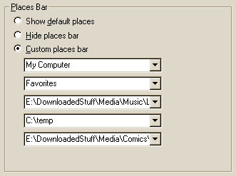
I’ve been playing around with the Windows 2000 Open File dialog box. Its Places Bar, which holds shortcuts to important folders, is useful, but could be better. I never use most of the default folders. You can change which folders are displayed using TweakUI, but even that is limited. TweakUI offers seven options for each slot, but by hacking the registry you can point to almost any of Windows’ standard folders. You can also type your own (fully qualified) folder names into each of TweakUI’s five combo boxes.
However, this doesn’t go far enough for me. There are a few files I open often, so why can’t I add them to the Places Bar? (Actually, you can by hacking the registry, but they won’t open when you click on them.) Instead, I have to stick them in the “Favorites” folder, then open them from within that—three mouseclicks instead of one. That’s strike one against flexibility.
Strike two: modifying the Places Bar requires either downloading an obscure utility or hacking the registry, when it could be as simple as a right-click option. Why bother to make a widget customizable if you don’t give people an easy way to do so?
The final strike comes in TweakUI, which won’t let you enter folder names longer than the combo box width—the field doesn’t scroll horizontally. (For longer names, you must edit the registry.) When did you last see this behavior in an editable widget? Did some UI wizard at Microsoft write a special non-scrolling combo box just to be annoying? And, finally, note how these special combo boxes don’t extend all the way across the pane. If you’re going to limit the amount of text to the width of the widget, why not extend the widget to use all available space?
Does anyone at Microsoft pay attention to UI design?
2005-06-02
Autodial on Windows 2000
My switch from Windows 95 to Windows 2000 was practically flawless, except for one minor difference: autodial. The problem is that I, being a security-conscious person, don’t store my ISP login password on the machine. Under Win95 that wasn’t a problem; when autodial is triggered, it brings up the dialer, which lets you enter the password before connecting.
Autodialling is different under Win2K. Disabling the “Always ask me before autodialling” option bypasses the dialer’s dialog box, and Win2K’s attempt to connect sans password fails. If the option is enabled, triggering autodial brings up a dialog box you must click through to get to the dialer. That’s right: to save the mouseclick it takes to bring up the dialer manually—the sole purpose of autodial—you must make an extra mouseclick.
While this problem affects only people who don’t store their ISP password on their computers (likely the minority of dial-up users), it makes the feature useless to them. Why offer the option at all?
2005-02-17
Handling Data Errors: Guess or Fail?
Lately I’ve been pondering Postel’s Law and how programs should handle data from foreign sources. If the data doesn’t fit the expected format, what behavior is appropriate? Should the program attempt to correct errors, or should it issue an error message and fail? (For purposes of this argument, ignore recoverable data errors.)
The specific case I have in mind is HTML. There’s been yet another URL spoofing problem in browsers that try to render invalid HTML. Mozilla takes a different approach when dealing with XHTML: if it receives invalid input, it shows where the error is and stops. It doesn’t try to render the document.
What if this had been the required behavior for all browsers from day one: render or fail, but no guessing? I can imagine some consequences. Because everyone would have had to write valid Web pages, the Web would have taken a little longer to catch on. Browsers would have fewer bugs. Finally, the annoyance of writing valid pages by hand would have spurred faster development and adoption of site creation tools.
Is it ever better to guess what incorrect input should be, rather than to report an error and fail? If yes, what factors influence the decision?
2004-10-30
Postscript
2008-06-06. In 2004, Mark Pilgrim made a good point: being liberal about what you accept may be critical when data comes from multiple sources via transclusion (e.g. trackbacks in a blog).
Web Site Hindsight
I created the first version of this site in 1995. Here’s the advice I’d send back in time to my then-self:
Get your own domain & server with CGI. The ability to use scripts will be worth the cost. As an added bonus, URIs will be shorter.
Automate housekeeping. Grab a copy of Perl, learn it, and spend the time to make good Web site management tools. It’s worth it (ref Larry Wall on laziness).
Keep everything in the root directory. Putting files in subdirectories makes URIs harder to remember and type, so don’t do it. Likewise, keep file names simple: if possible, one word, all lower case. Give the site logical structure using breadcrumbs, but keep the guts simple.
The biggest mistake I made when creating this site was to use a verbose URI naming scheme. Properly done, I could have cut the average URL size by 50%. Compare:
- http://mli.name/tech.notes.html
- http://www.rdrop.com/~half/Creations/Writings/TechNotes/short.notes.html
I’d still like to make the switch, but that would break a lot of incoming links (and everyone knows that good URIs don’t change).
I’d also suggest keeping change logs and using a page template with rich metadata from the beginning, as well as using revision control on the content, but that’s just perfectionist housekeeping.
2004-10-12
RSS Lament
My CGI RSS aggregator isn’t as useful as I expected. This is due to not to the aggregator’s admittedly poor coding, but rather to the RSS standard itself. The syndication part of RSS works fine; some feeds don’t validate (which is surprising, as the RSS spec is so simple it’s almost a challenge to get it wrong), but that doesn’t prevent my aggregator from grabbing items from them. It’s the semantic side that’s a mess. Few people write really good RSS; for example, one site always leaves its items’ title elements blank, while another stuffs the entire article text into the description element.
Sites that aggregate others’ RSS feeds, such as Blogdex, show just how inconsistent the system is. What’s the point of having a standard if it makes extracting meaningful information a chore?
Those who syndicate feeds would benefit from reading Jakob Nielsen’s essay on the importance of writing good microcontent.
2004-04-23
Leave Text the Default Size
A guideline for Web page design: most of a page’s text should be the default text size.
Rationale: Web browsers allows people to choose the font (face & size) they find most readable. Filling your pages with <font size="-1"> or style="font-size:smaller" implies that either (a) you’re purposely ignoring your visitors’ preferences, or (b) you’re unaware of the problem you’ve created. Which would you rather be considered: arrogant, ignorant, or competent?
If you object that your design doesn’t look good at the default text size, I suggest you should concentrate on creating a useful site, not a piece for your design portfolio.
Rules of thumb:
- Treat the default text size as the minimum text size.
- Make extra-important text larger, not less-important text smaller.
The customary exceptions to this guideline are page meta-information (e.g., visible location or freshness dates) and site navigation links. They are often given a font one size smaller than the default
This guideline applies equally to application interfaces.
2004-03-14
CSS Rule of Thumb #1
For CSS-based page layout that looks good on most browsers (e.g., Opera, Mozilla, and IE 5 & 6), use pixels for properties that affect box width (width, margin, border, and padding), prefer ems for vertical properties, and avoid setting height.
I’m not sure how universal this is, but knowing it would have saved a good deal of frustration.
2004-01-24
An XML Syntax Question
Since XML tags must nest correctly, why must a closing tag identify which element type it closes? Every closing tag automatically closes the last open tag, so what do we gain from typing </p> instead of </>? Is the added readability worth the risk of mismatching opening and closing tags?
2004-01-15
A CSS Challenge
This has been extracted to its own page.
2003-12-28
Naked Links
This afternoon, I wondered what the Web would be like if HTML allowed only naked links, i.e. the text displayed for the link is the URL of the link’s target. For example, if you’re linking to http://www.jerkcity.com/, the link would be displayed as http://www.jerkcity.com/ instead of, say, Jerkcity comic.
Consequences:
- There wouldn’t be as much linking, because links would be ugly.
- Links would probably be segregated from other page content (e.g., given at the end of the page, and referred to by number).
- Web sites would be apt to have short and Guessable URLs.
- Less scamming and deceit (I wish).
I don’t think the benefits outweigh the drawbacks. Why then do I find naked links acceptable in wikis?
2003-08-20
Web Site Design Aphorisms
The two wisest things I’ve ever said about Web site design:
Search engines index content, not design.
So spend most of your effort on content.
Browsers change faster than standards.
So write to the standards, not to a specific browser.
2003-06-28
A Workaround for Eudora 3.0’s “Notify Application” Feature
One useful feature of Eudora 3.0 is its ability to invoke an external application when a user-defined filter fires. I use the feature to run a Perl script that automatically adds email addresses to my whitelist.
However, there’s a problem with using Notify Application on Windows 95. When a filter with a Notify Application action fires, Eudora expands any %x parameters, then passes the modified command to a DOS command interpreter. DOS then performs any redirection before executing the command. That’s fine if your data is “johndoe@foo.com”, but if your data looks like “John Doe <johndoe@foo.com>” the command will fail due to ‘<’ and ‘>’ being treated as redirection flags. Quoting parameters (e.g., putting “%3” in the command line) does not solve the problem.
The workaround is not to pass specific fields from the message to your application, but to instead send the entire message using %6. You’ll have to do more work to extract what you need from the message, but at least DOS won’t swallow part of it.
2003-06-19
Customization is a Hard Problem
Usability guru Jakob Nielsen has recently published two articles which envision a world of dynamically updated, ostensibly helpful devices. I’m having trouble believing that this bright shiny new world will come to pass, for two reasons:
I’ve read almost all of the SF works of Philip K. Dick. In his worlds, devices designed to be helpful are annoyances. Who can forget Joe Chip arguing with his door in Ubik?
The door refused to open. It said, “Five cents, please.”
He searched his pockets. No more coins; nothing. “I’ll pay you tomorrow,” he told the door. Again he tried the knob. Again it remained locked. “What I pay you,” he informed it, “is in the nature of a gratuity; I don’t have to pay you.”
“I think otherwise,” the door said. “Look in the purchase contract you signed when you bought this conapt.”;
In his desk drawer he found the contract; since signing it he had found it necessary to refer to the document many times. Sure enough; payment to his door for opening and shutting constituted a mandatory fee. Not a tip.
“You discover I’m right,” the door said. It sounded smug.
In today’s pay-for-everything world, I find it hard to believe that doors will not behave this way.
The other (and I desperately hope more realistic) reason is that it involves several hard problems. Tolerable personalized services have stringent requirements:
Authentication must be automatic and foolproof. No one wants to use a system that requires a login, much less a toaster that requires a login. Joe Chip’s door passes that test, at least; it recognizes Joe with no effort on his part.
Customization information must be instantly available to any handy device. When your wibble breaks, why should you be required to spend time training its replacement, when (conceptually) customization information is not tied to a specific wibble? Why should you ever have to train more than one spell checker? Unless you use different ones in very specific domains (e.g., medical transcription), there is no good reason.
User-friendly customization must be distributed and transparent. Despite lots of effort, no one’s yet approached that goal. Fortunately.
2003-03-08
CSS/HTML Abuse: Example 1
An obfuscated HTML challenge inspired me to create a combination of CSS & HTML so perverse I had to post it. Style sheets were created to separate presentation from content, not content and presentation from structure!
2002-12-15
Is Hypertext Research Dead?
Has the success of HTML killed hypertext research? I haven’t kept up with the field, but the few incremental innovations I’ve thought of have been reinventions of ideas conceived more than a decade ago. With the ubiquity of HTML and the Web, is there any possibility of an improved hypertext system gaining widespread use?
2002-11-24
Why No Short Pages?
Why don’t I use the pattern APPROPRIATE LENGTH consistently? I’m usually not afraid to make long pages, but short pages are a different story. For example, why does this page exist when each short note could be its own page? Why do I tend to write comments as end notes, rather than as separate pages? Where is the balancing point between inclusion and splitting?
2002-11-24
Is Site Identification Always Useful?
Do me a favor. Follow this link, examine the page, and return here.
Now that you’re back, answer this question: why does the page have links to the rest of the site? The answer used to be obvious to me: I posted the page on my site, so visitors should have an indication of where it is. Lately, though, that answer just doesn’t make much sense. Its presence on this site is a coincidence. The page’s content has nothing in common with the rest of the site. So why give the page links to the rest of the site?
Pages with related content should link to each other. For example, the personal pages on this site should, because they have common element (they introduce their author). However, singleton pages like the one linked to above work just as well on their own. What’s gained by shoehorning them into a site?
Points and questions to consider:
Intrasite links help visitors find related content. When a site has no other content related to a page, intrasite links on that page are a distraction.
Giving neutral pages the distinctive look of a site arbitrarily balkanizes the Web. The most important thing about a Web page is the information, not where it’s hosted. If I’m searching for information on narjoobs, why should I care that the narjoob F.A.Q. page is hosted at a http://gexor.frub?
Following the last point, what would happen if the connection between page URL and domain/path/name were broken (à la FreeNet)? Would Web page design become generic if site identification became unimportant?
Minimal HTML would be a good starting point for creating a template for generic pages.
How would pages be found if there were no intrasite links to them? Would page registration services fill this need?
2002-11-24
Another Web War: Site Creators vs. Visitors
For several weeks I intended to write about why opening new browser windows using the TARGET attribute is bad. I lost interest in this project after installing the latest version of my favorite browser, which allows users to prevent new windows from opening.
Reflecting on this led me to an interesting realization: a quiet war is being fought. One faction consists of Web site creators who want to determine how their sites appear and behave. Opposing them are browser programmers and Web site visitors, who wish to retain control of how their browser behaves. An arms race exists between these two sides. When Web site creators adopt techniques that degrade browsing, browser programmers respond by adding new capabilities to browsers -- specifically, the ability to disable features that were not previously seen as a problem, but are being abused by Web site creators.
Opening new windows is one example, but a quick look at Mozilla’s preferences reveals a dozen more: Java, Javascript, GIF animation, cookies, underlining of links, and so on. Taking this to its logical extreme are user-defined style sheets, which allow pages to be presented however visitors prefer, not Web site creators.
The preference that is most telling is the user agent string, which identifies a browser to Web servers. It’s primarily used to serve browser-specific versions of pages to different visitors. It’s a sad commentary on the state of the Web that this is even needed. What happened to browser neutrality?
2002-11-22
On (Not) Eliminating Spam
A few more nifty schemes for filtering spam have recently surfaced: use of Bayesian statistics to identify spam, and challenge/response protocols to guarantee the sender’s intent. These techniques are effective, and will do nothing to eliminate spam.
Don’t misunderstand me. These techniques will prevent the recipients of spam from ever seeing it. That’s a good thing. However, they do nothing to address one of the three major problems of spam: its impact on the Internet as a whole.
The proponents of improved filtering make the case that it makes spam less effective. Near-perfect filtering, they claim, will make spamming unprofitable, since almost all spam will be trashed automatically.
The problem is that “almost”. Unless adoption of this practice is universal, there will still be targets for spammers. As spammers see their success rate decreasing, they’ll increase the amount of messages they send. The amount of mail traffic on the Internet will increase, not decrease.
Of course, that’s theory. In the real world, there are two other factors that affect the situation. One is that those people now instituting improved filtering are those who wouldn’t have responded to spam anyway, so spammers will see no change in their success rates. A balancing factor is that there is a practical limit to the amount of junk email one spammer can afford to send. So if the utopians are correct, spam will eventually die. The problem is that to reach this point, near-perfect filtering must be adopted by almost everyone on the Internet. This only way this will happen is if it is built into all major email clients, including Web mail systems. And I’ll believe that when I see it happen.
This problem could have been solved years ago by the widespread integration of PGP or hash cash into email clients. But did it happen? Not then, not now, and not in the foreseeable future.
So it’s time to put on our thinking caps. Is there any way to eliminate spam that doesn’t require universal adoption?
2002-08-17
Is URL longevity inversely proportional to length?
The more Web pages I write, the more I’m becoming convinced that the lifetime of a URL is inversely proportional to its length. Shorter is definitely better. Consider the following URLs:
http://www.acme.com/http://www.widgets.com/manufacturers/acme.htmlhttp://findibuster.com/finder.php?topic=widgets+acme&crit=294965&len=j445%98k0029&amval=ji&results=15
The first looks like the home of the widget maker Acme. I expect that to stay around for as long as Acme lasts.
The second looks like a page about Acme on a generic widget site. I would expect this site to have less of an interest in maintaining the information than Acme does.
The third example is widget information hidden behind a script. When I see URLs like this, I can’t help but think that the site’s owner doesn’t care enough about its content to categorize it so that humans can understand it. The unspoken assumption is that the information isn’t worth the effort to catalog. Why then should I expect the information to have a lifetime that’s measured in anything longer than weeks?
The same logic holds for personal sites. I don’t put much faith in the continued existence of a site on a free Web hosting service. However, if that site moves to its own domain (which invariably has a shorter URL), its credibility increases greatly.
Is having a domain of one’s own the greatest part of one’s credibility? It does show that the domain’s owner has made a commitment to the site’s continued existence.
Are there any empirical studies of the relationship between a URL’s lifespan and its length? It would be interesting to compare Google’s link information from two different times to determine whether this holds true. With enough data, one could in theory make the interval between observations as small as one pleased, at least until random noise drowns meaningful information.
2002-06-17
Menu Items are not Buttons
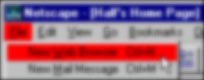
Today I noticed a difference in the interfaces of Windows 95 and Windows 2000. Compare the appearance of the main menu item File in two applications:
![[Netscape: selected item has selection color]](Netscape.menu.gif)
Netscape 3.04: a selected main menu item has Windows’ “selected item” colors.
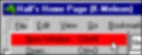
![[K-meleon: selected item has button border]](K-meleon.menu.gif)
K-meleon 0.6: a selected main menu item has a button border in its pressed state, not Windows’ “selected item” colors.
Selecting a main menu item in a Win2K application makes that item look like... a button. It’s not a button and it doesn’t behave like a button, but it looks like one. This makes it less usable to me. I use that lovely light yellow color to indicate where I am in a menu. Low contrast pseudo-button borders are just plain hard to see. [Consider these blurred versions: Netscape, K-meleon. I changed the highlight color to make the result obvious.]
There’s another problem besides legibility. Giving main menu items and submenu items different appearances creates a false distinction between them. Different appearance implies different behavior, which isn’t the case here. They’re both menu items; let them be identifiable as such.
Let’s review some basic user interface elements:
- Buttons are for one-click actions.
- Main menu items organize submenu items.
Is the difference between them not obvious?
2002-06-06
Hyperlink Granularity
Perennial hypertext problem: how fine-grained should links be? HTML requires authors to explicitly create link targets, while other hypertext systems (e.g., Xanadu) allow links to any word or phrase in any document. The opposite approach is to allow links only to documents, following the philosophy that if something is important enough to be a link target, it should be a separate document. (Wikis use this approach to linking.) The extreme is to prohibit deep links entirely, allowing only links to a site’s home page. (Some businesses think this is a good idea.)
What factors influence whether a given link granularity is appropriate for a particular hypertext system?
Link granularity continuum: character - phrase - section - page - site
2002-05-13
A New Type of Link Target
The protocol for creating hyperlinks on the Web is incomplete. Say you want to link to something in this note. You have two choices: you can link to the document (short.notes.html), or to this note’s header (since it has a named anchor, short.notes.html#ANewTypeOfLinkTarget). But what if you want to link to a specific paragraph, or just a phrase? You can’t.
Consider this alternative: to the two kinds of hyperlinks targets we add a third, called something like content anchors. To link to the phrase "search engines index content, not design" in foo.html, you would create a link to a content anchor like so:
...and here’s some good <A HREF="foo.html%search engines index content, not design">Web design advice</A> that we should always keep in mind...
Browsers would treat content anchors and named anchors almost identically. The only difference is that instead of searching a page for a matching named anchor, the browser would search for the specified text, and begin displaying the page at the first match.
Imagine a World Wide Web in which every single word is a potential link target, instead of the link-target-poor Web that now exists.
2002-03-06.
Postscript
2002-03-29. This was anticipated more than three decades ago by Ted Nelson’s Xanadu project.
Imitation is the Sincerest Form of Usefulness
This Web site has slowly evolved since its creation in the summer of 1995. During the six and half years of its existence to date, I’ve stolen a number of Web site design principles from other sites. Imitation is the sincerest form of usefulness, as they say.
Here are some of the design elements I use, and their sources:
The idea of indicating changes with icons ( and ) came from Yahoo!. The icons I use on this site are similar to Yahoo!’s, but are original.
The breadcrumbs at the top and bottom of each page came from Jakob Nielsen’s useit.com, which is a gold mine of useful Web site design information.
Putting the date of the last update in the page footer was inspired by several sources, including Charlie Montney’s Web Lair.
Adding each page’s URL to its footer came from Mary E.S. Morris & Randy J. Hinrich’s dated but still valuable book Web Page Design: A Different Multimedia. (I probably saw this elsewhere, but have forgotten where.)
A previous version of The RzWeb inspired me to use abstract navigation icons. After several years, I dropped them in favor of text links, which are clearer.
Paul Schwartz’s Zeugma led me to consider adding the date of last page update on index page links. This required a format which was too restrictive aesthetically, however, and I only used them for a short time. A history page is generally a more effective way to let visitors see what’s recently changed.
The sparse design of Cosma Shalizi’s site got me thinking about Minimal HTML, which I have adopted for new pages. (It’s ironic, though, that Mr. Shalizi’s pages neither validate nor conform to Minimal HTML,)
2002-03-05
Measuring Web Page Length
Is there a good way to measure Web page length? The answer to this question depends on the reason for asking it. For example, if you’re concerned about download times, then it would be appropriate to measure the page and its associated files (images, style sheets, etc.) in kilobytes. What I’m searching for is somewhat different, though. I’m trying to formulate an objective measure that determines how long it takes me to read a page. This is for me the best indicator of page length, since it accurately reflects the maximum time I spend on one page.
I’ve considered three formulas for page length: w/s, w2/s, and w2/(s+g), where w is the number of words in the HTML page (as determined by my text editor), s is the size of the page in kilobytes, and g is the size of all included files in kilobytes. Calculations for some pages yield these results (rounded to two decimal places):
| Page | w/s | w2/s | w2/(s+g) |
|---|---|---|---|
| Performance Art Digest | 0.00 | 0.01 | 0.00 |
| Gallery | 0.14 | 1.49 | 0.07 |
| MLI Home | 0.21 | 6.89 | 4.87 |
| Sonnet #1 | 0.45 | 21.09 | 21.09 |
| Knotworking | 0.58 | 107.70 | 9.94 |
| Cascading Style Sheets Considered Harmful? | 0.72 | 154.53 | 154.53 |
| Matthew’s Advice on Coming Out (offsite) | 0.15 | 1588.87 | 1050.97 |
| Book List - 2001 | 0.14 | 3019.87 | 3019.87 |
(These values were computed during February 2002. Most pages have changed since then.)
The first formula, w/s, gives identical values for the extremely short Gallery and the very long Book List - 2001. This rules it out as a useful measure. The remaining two formulas better reflect reality, with much wider ranges of values given to different pages. What distinguishes the two measures is how much weight is given to graphics. For pages without graphics, the values are identical. Now consider pages with graphics; compare the values of Knotworking to those of Cascading Styles Considered Harmful?. Is the latter less than half again as long as the former, or over fifteen times longer? That’s a subjective decision.
Since I tend to ignore decorative graphics, I prefer w2/s. This formula makes intuitive sense to me, too. It multiplies the number of words on the page, w, with the page’s “leanness ratio” (words divided by page size in kilobytes), w/s. Pages with lots of HTML formatting are fatty, while those that concentrate on content tend to be lean. Combining a lean page ratio with a lot of words equals a long page.
Perhaps the best measure of all would be w2/(s+Cg), where C is a constant. The optimal value of C could be determined by experiment, or each person could choose his or her own.
Now that we have an objective measure -- or rather, two -- of page length, what can be done with it? Not a lot, really. However, it is an amusing statistic. Try calculating it for some of your pages. How long, and how lean, are they?
(For the record, this page’s values as of this writing are w2/s=256.93, w2/(s+g)=234.72.)
2002-02-12
A Smarter Web Browser
Ever since I first used Mosaic, I’ve wanted a Web browser that used the structure of a page’s header elements (hx) for navigation. The browser would parse the page and present its structure as a tree, with a node for each header element. With just three commands [expand/collapse current node, expand/collapse all nodes of this level, show/hide non-header content], navigating a long document that used every header from h1 to h6 would be a snap. This would also be useful for multi-level lists.
I believe that if this had been a part of graphic Web browsers from the beginning, even as an alternate display mode, a much larger percentage of documents on the Web today would be structured.
2002-01-31
Postscripts
2002-02-12. Amaya 5.3’s “Table of Contents” feature is similar to the outline view mode described above. The primary difference is that the table of contents appears in a separate window. This makes navigation awkward, as the user has to switch between different windows. Also, the table of contents is a static list of links, not a dynamic tree.
2002-03-29. This was anticipated in the 1980s by the “stretchtext” feature of Peter Brown’s Guide project.
Windows Shortcut Names
Windows’ implementation of shortcuts (*.lnk files) is frustratingly incomplete. I’ve commented elsewhere on the inability of applications to create shortcuts; the naming of shortcuts is another annoyance. Windows names a shortcut by adding .lnk to the shortcut’s text. This scheme works fine unless you want to create two shortcuts with the same name. Who, you ask, would someone do that? I would. When I’m working on a Web page, I’ll sometimes make a shortcut to it on my desktop. I’ll also make a shortcut to the same file, but opening it with a text editor instead of a Web browser. In this case it makes perfect sense for both of them to be called, say, “Page in Progress”; one shortcut views the file, the other edits it. Under Windows, though, I have to give a different name to one of these shortcuts. (Granted, one can pad a second name with a trailing space, but that’s a hack.)
Another minor annoyance is that you can’t edit the shortcut’s text from the shortcut’s property sheet. The only way to rename it is to edit the text directly, or use the shortcut’s context menu. This makes little sense; isn’t a shortcut’s name one of its properties?
Both of these problems stem from the fact that a shortcut’s display text is not distinct from its filename. There’s no logical or technical reason they must be identical, but MS thought they should be. The result is shortcuts that, rather than making Windows easier, make Windows more frustrating.
2002-01-28
Several earlier short technical notes can be found here.
Last updated 6 June 2008
http://www.rdrop.com/~half/Creations/Writings/TechNotes/short.notes.html
All contents ©2002 Mark L. Irons
Previous: CSS ··· Next: Minimal HTML